LATAM
— Spicy jalapeno fatback in kevin chuck ad dolore tri-tip aliqua ut ea shank.
IJ LATAM
brand identity • Art Direction • DIGITAL • print
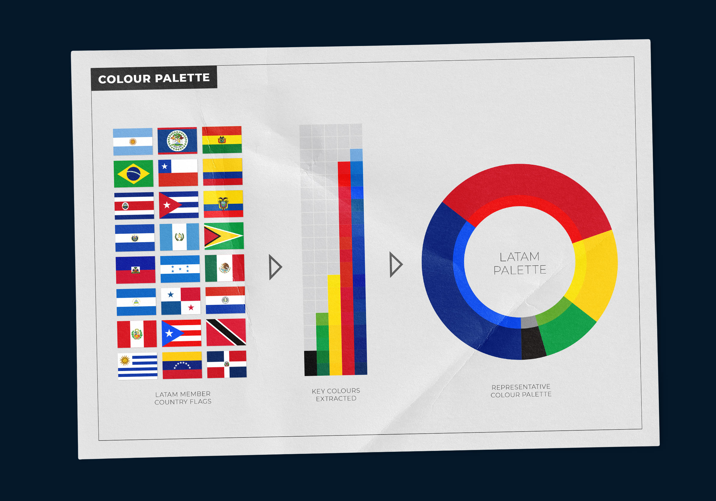
Part of Euromoney’s Infrastructure Journal Portfolio, the IJ LATAM event was the first in a series of events and awards that were in need of their own identities, and is the first of the group to adopt a flexible design system. We developed this system using imagery and a colour palette inspired by Latin American culture pared with a modern typeface and flexible grid system. The result being an identity that can be adapted across IJ’s other events by simply swapping out relevant imagery and colours to suit the particular event location, theme or content matter.